Redesigning Disease-Drug Relationship Exploration at Biorelate
Biorelate's platform, Galactic AI, uses NLP and machine learning to automatically extract causal relationships between drugs, genes, and diseases from published biomedical literature. Researchers use it to explore cause-and-effect pathways. For example, understanding how a specific drug or entity affects a disease through a chain of biological mechanisms.
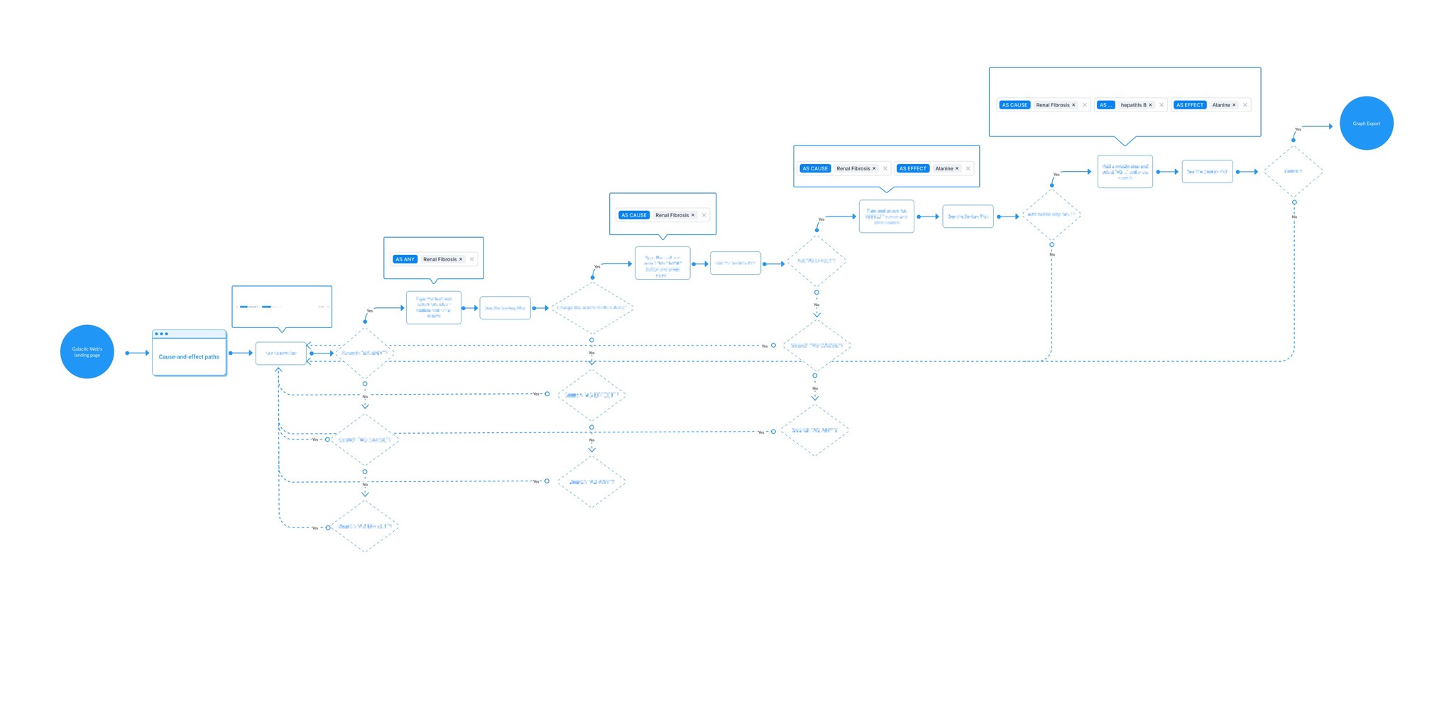
The core visualisation for this is a sankey-style diagram called Cause-and-Effect paths was the most-used feature on the platform, but users were struggling with it. I was brought on as the sole designer to rethink how researchers interact with this data.

Lead Designer
July - Nov 2023
Web
$5 Million (2024)
50+
Challenge
Researchers were using Cause-and-effect Paths to explore disease-drug relationships, but the visualisation had several specific problems:
The diagram was hard to read at scale. When queries returned dozens of relationship paths, the Sankey diagram became a wall of undifferentiated lines. Users couldn't distinguish meaningful connections from noise.
Confidence levels were unclear. Each relationship had a confidence score based on the strength of supporting evidence, but this was displayed as a raw number. Users told us they didn't know what the numbers meant or how to act on them.
Navigation between views was disjointed. Researchers needed to move between a visual graph view and a detailed table view, but the two weren't well connected. Switching contexts meant losing their place.
The business context: Biorelate was preparing for its largest data update, which would significantly increase the volume and complexity of relationships shown. If the visualisation couldn't handle the current data well, it would break entirely at the new scale.
Results
After the redesign launched, we tracked impact over 3 months:
Engagement with Cause and Effect Paths increased by 42% - More researchers were using the visualisation as a primary exploration tool rather than defaulting to the raw data tables.
User retention improved by 35% - Users who tried the redesigned feature were significantly more likely to return to the platform in subsequent sessions.
Session depth increased by 54% - Researchers were exploring more relationship paths per session, suggesting the redesign made it easier to follow threads through the data rather than giving up early.
Our metrics came from Pendo.
42%
Increase in User Engagement
35%
Increase in User Retention
54%
Increase in Time Spent on App
Process
Understanding the problem (2-3 weeks)
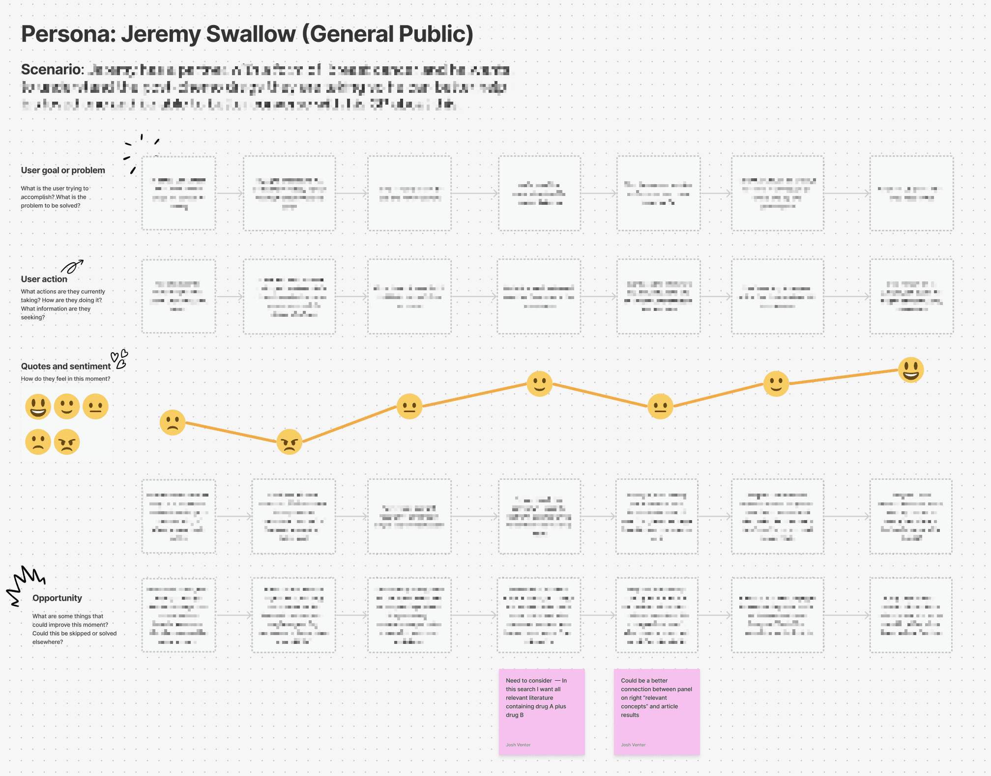
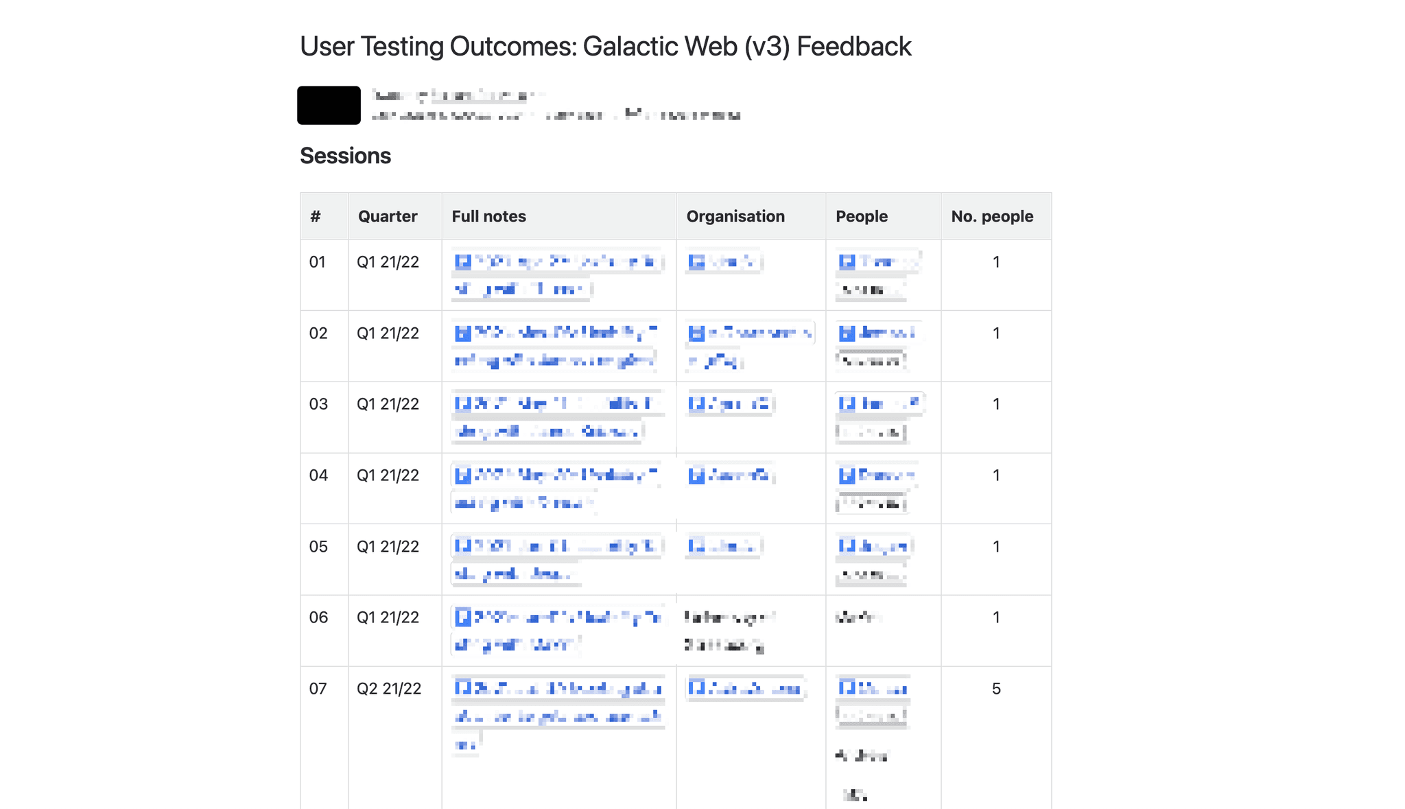
I started by interviewing 12 researchers and reviewing existing session recordings in Pendo. The most important thing I learned was that researchers weren't struggling with the visualisation because it was ugly they were struggling because they couldn't tell which relationship paths were worth investigating and which were noise. When a query returned dozens of connections, everything looked equally important, so users defaulted to exporting data to spreadsheets and doing their own manual filtering. This told me the redesign wasn't just about making the visualisation look better it was about changing the underlying information model so that evidence strength and confidence were visually encoded into the diagram itself, letting researchers prioritise paths at a glance instead of reading every one.
Exploring approaches (2-3 weeks)
I explored 4 different approaches to the visualisation. Our first approach would have introduced a completely new chart type that gave us more control over layout and filtering, but it meant abandoning the Sankey format that researchers were already familiar with and would have required significantly more engineering effort. The second approach kept the Sankey but added a separate filtering panel alongside it. The third added colour-coding and confidence labels directly onto the existing paths. The fourth was a hybrid design. It was a simplified Sankey for overview with a linked detail table below. We went with colour-coding the paths by confidence level combined with interactive filtering, because it improved readability without forcing users to learn a new visualisation type and was feasible within our engineering capacity. The key constraint was that the Sankey library had limited support for custom styling per path, so engineering needed to extend it which meant we had to keep the visual changes focused rather than attempting a full rebuild.
Testing and iterating (2-3 weeks)
We tested with 8 users. The biggest surprise was that the numerical confidence scores we'd initially kept as tooltips were still confusing even as a secondary detail, users kept asking what a score of 0.73 actually meant in practical terms. For example, one researcher said they'd ignore any path unless someone told them the threshold for "reliable," which defeated the purpose of showing confidence at all. Based on this, we replaced numerical scores entirely with High, Medium, and Low labels tied to the colour-coding, and added a brief explanation of what each level meant when users hovered over the label.
Shipping and measuring
We launched to all users in November 2023. We tracked engagement with Cause and Effect Paths, session depth, and return usage using Pendo. The results are above.


Conclusion
The biggest lesson from this project was that in a specialised domain like drug discovery, "simplifying" the interface doesn't mean removing complexity it means giving users better tools to navigate complexity on their own terms. The confidence level redesign (from numerical scores to High/Medium/Low) was the clearest example: we didn't reduce the data, we changed how it was communicated.
If I were starting this project again, I'd spend more time on the table view earlier in the process. We treated it as secondary to the Sankey diagram, but session data showed that many researchers actually preferred the table for detailed analysis and only used the visualisation for initial exploration. By the time we understood that, we'd already allocated most of our design and engineering effort to the graph view. A better split would have been closer to 50/50.
The visualisation is still evolving and changing. Recent data update has introduced new scale challenges that the current design will need to accommodate.